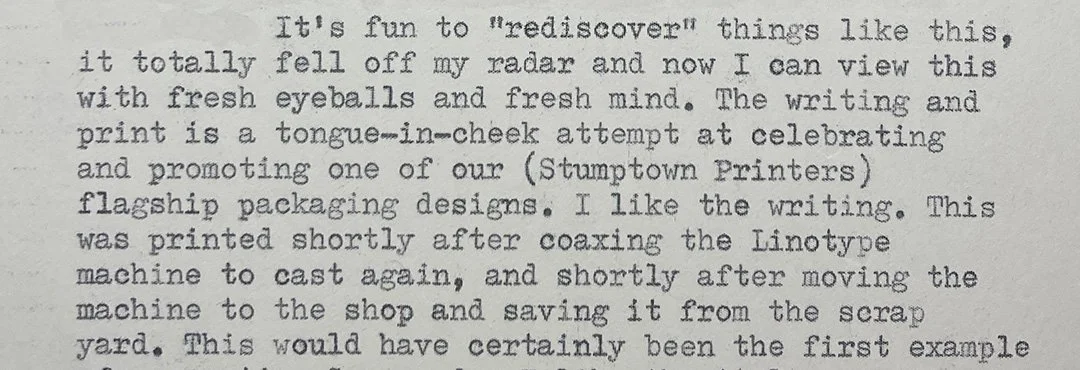
Arigato Pak! Broadside, printed from hot-metal Linotype Garamond
Garamond Linotype Mats
An early logo for the Arigato Pak!
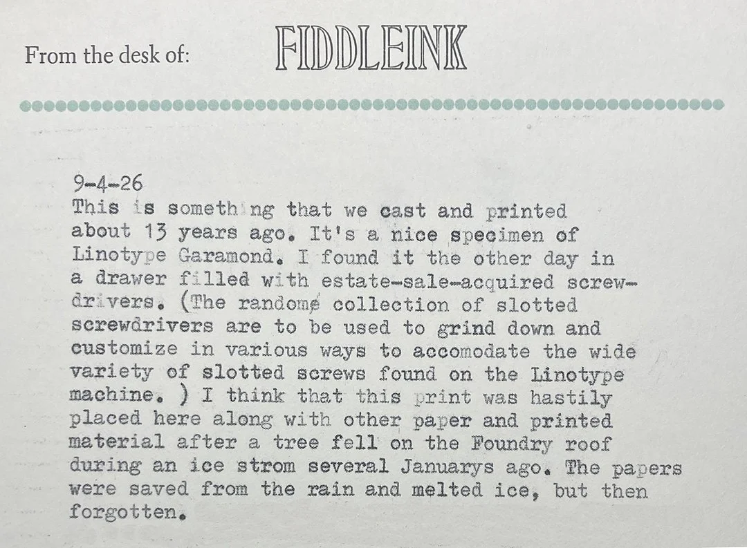
Linotype Garamond Type Specimen from “Big Red”
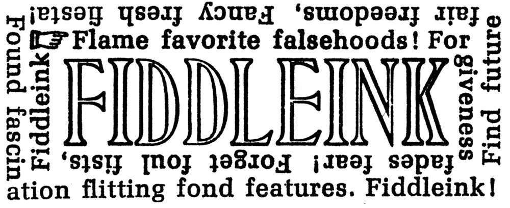
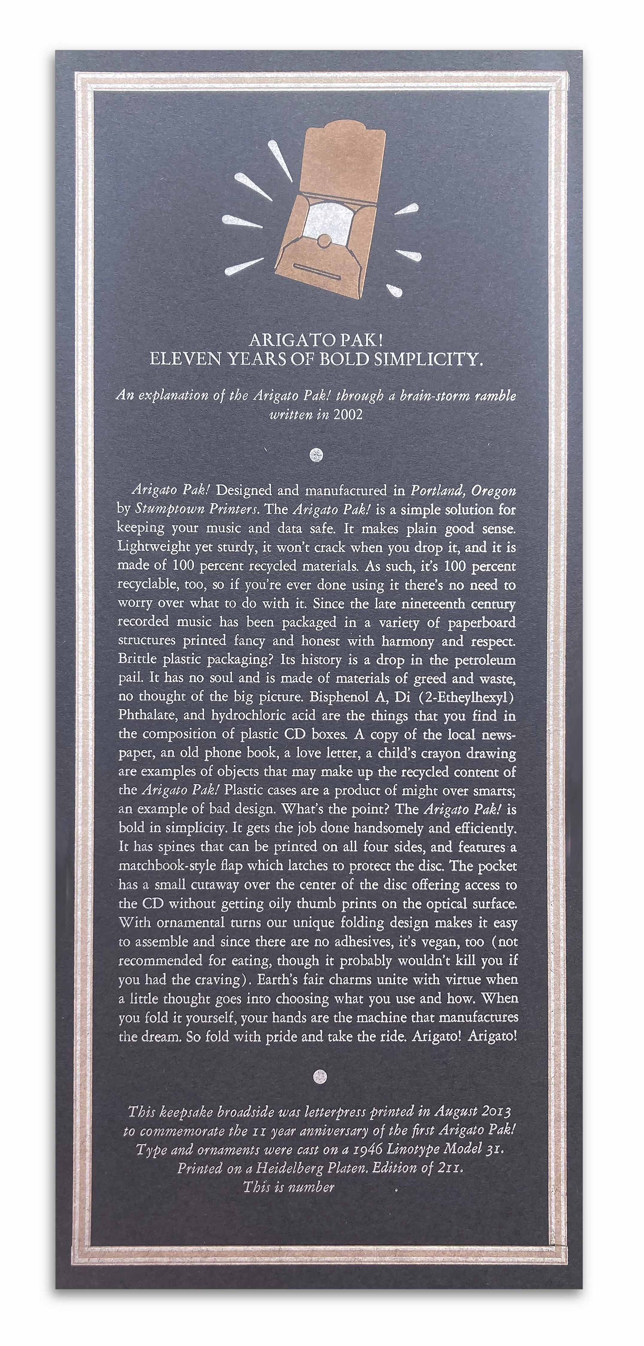
Arigato Pak! Broadside, printed from hot-metal Linotype Garamond
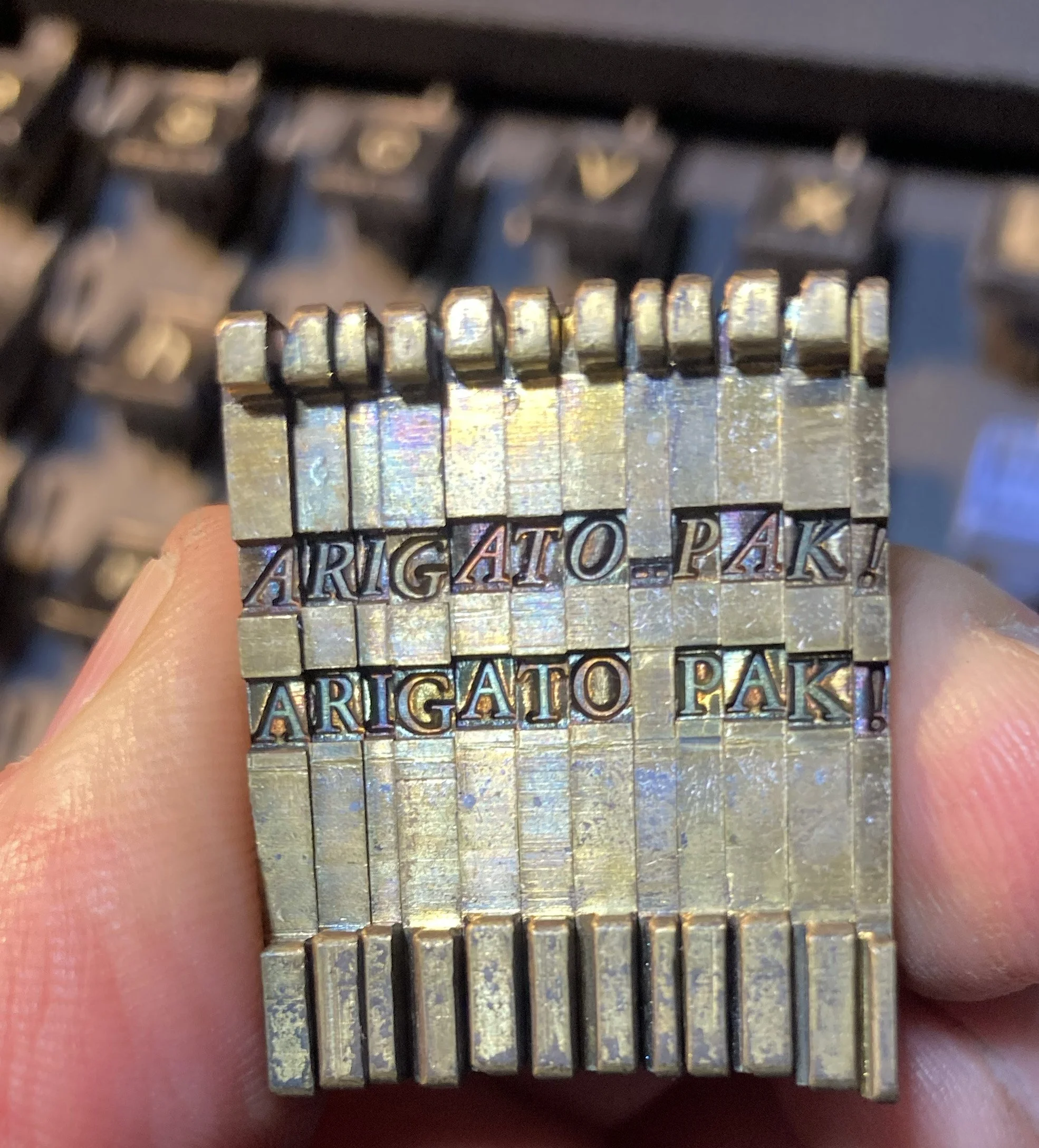
Garamond Linotype Mats
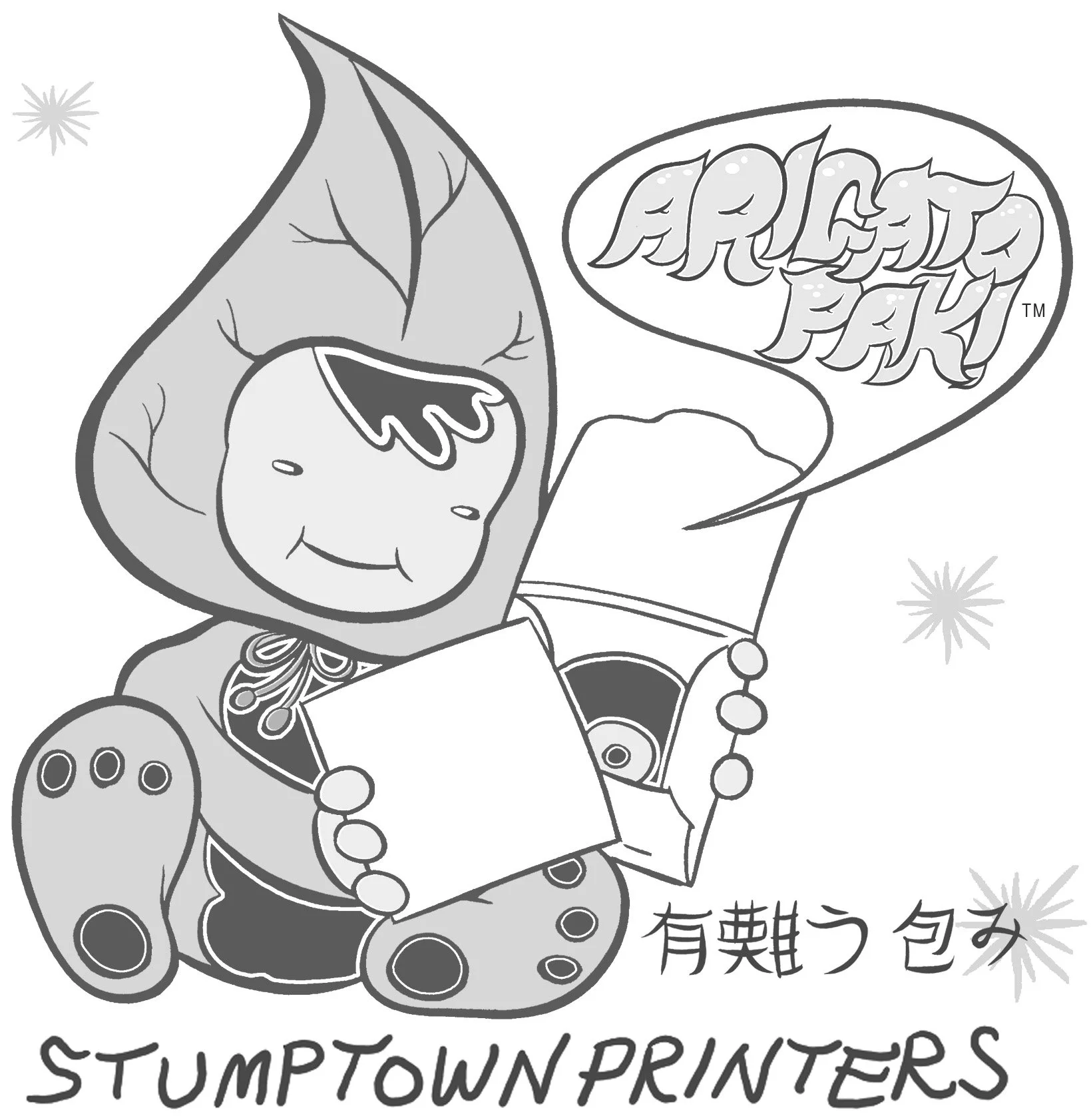
An early logo for the Arigato Pak!
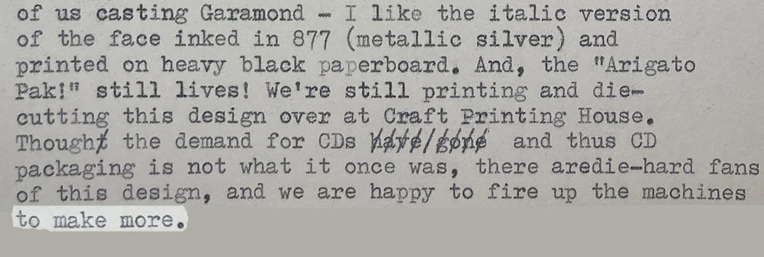

Linotype Garamond Type Specimen from “Big Red”

This little guy has made it to far corners of the globe, he's traveled in envelopes to explore analog spaces in Europe, the UK, New Zealand, Australia, Canada and all over these United States. His communications back to the print shop here in the hills above Clatskanie inform us that his travels have been successful, and that he has been finding some good spaces. Thanks to everyone who is currently hosting him. This particular mission is almost complete (since I'm nearly out of the edition). However, Spaceband Spaceman has been a good explorer and ambassador for the unexpected down time one may encounter in their busy lives, so there will be future missions by newer Spaceband Space-beings. Look for them in off-line spaces.
Type Casting Machinery used: Linotype Model 31 (1946, originally purchased by Pioneer Printing in Vancouver, Washington. Stumptown Printers was the second owner. Now the machine resides at the C.C. Stern Type Foundry) Types cast: Helvetica 6pt^696, 12^153 vertical gothic.
The text written on Spaceband Spaceman's Flag:
Made from precision machined steel and found at home between brass Linotype matrices, we Spacebands hold meaning together by providing space between it. We make incremental space determined by the length of words in a line. Without my kind, the Linotype machine would have been a flawed design. And without space between things, life would be a constant jumble. Now we Spacebands travel beyond our world of brass, type metal, and cast iron in search of new spaces where we may find work. My space vehicle of choice is the space between the folds of an envelope. I've travelled in the space between "far" and "wide," I discovered that the space between books on a bookshelf is divine. I've found a perfect space between "breathe in" and "breathe out," there's plenty of work for me between the place called "to" and the place called "fro." I've even found space between coffee grind and coffee brew. And lovely space between the sound of raindrops falling on a metal roof. There's plenty of space to explore. Can you think of more? If you find some time between your meetings and tasks, look for me there. The Spaceman Spaceband will be doing what I do best: holding together the meaning of the moment through space, and providing a pause before what's next.
If you'd like to catch a Spaceband Spaceman before he disappears into space, you can purchase one through the C.C. Stern Type Foundry marketplace, where a percentage of the sales goes towards programming at the Foundry.
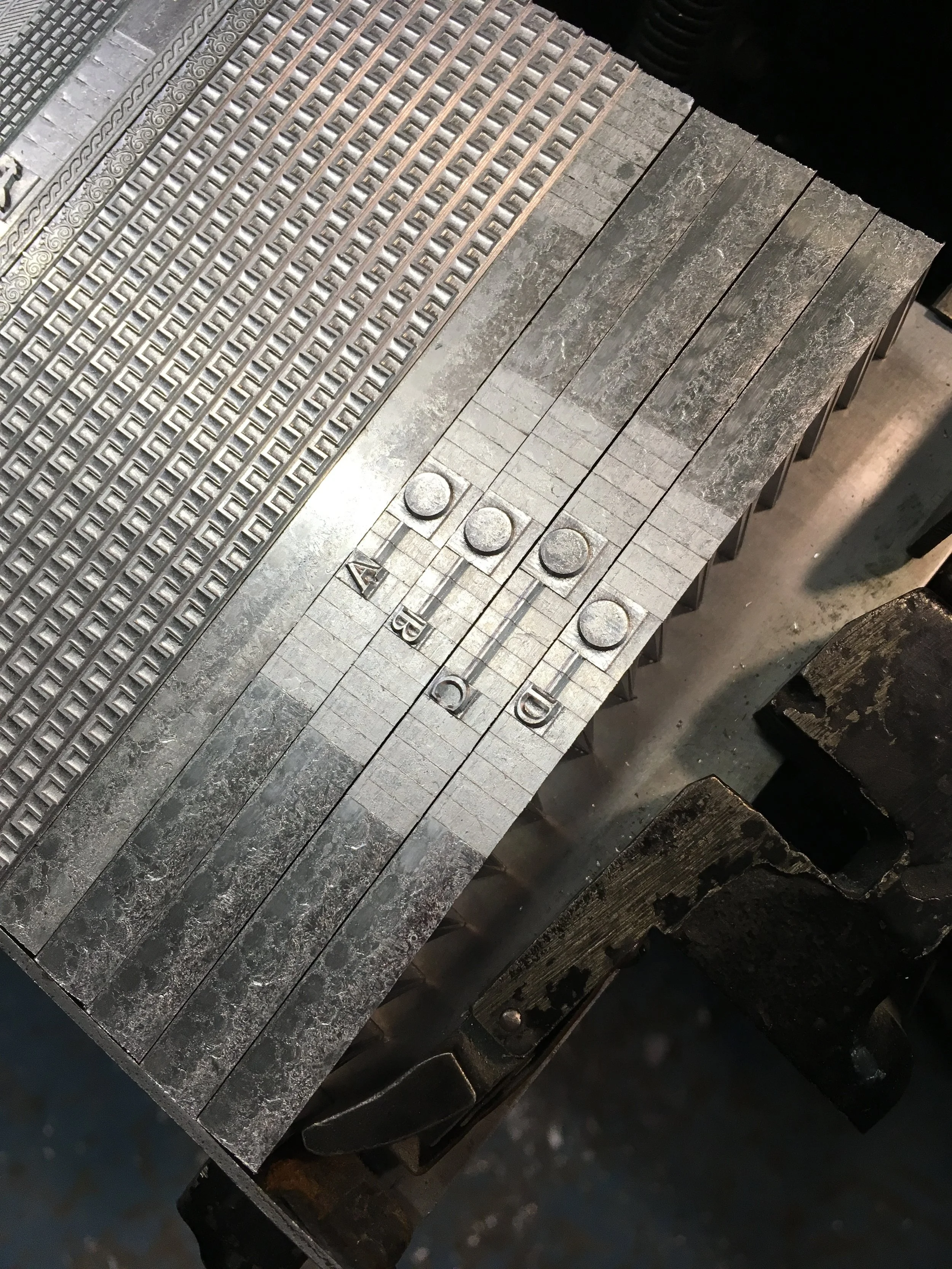
Some Spaceband Spaceman guts
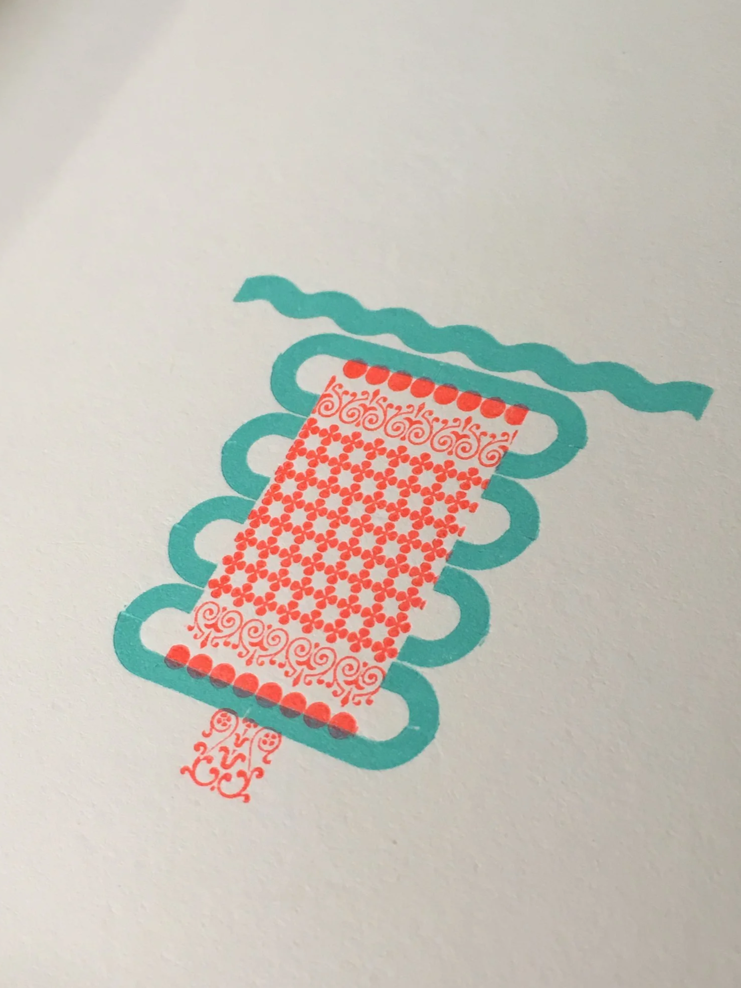
A torso with perhaps a fancy ding-a-ling
Happy National Poetry Month!
The first poetry postcard from the C.C. Stern Type Foundry's monthly 2026 series is on its way to your mailbox. Featuring the poem "Window Sash Weight" by Ed Skoog and printed from metal types cast at the C.C. Stern Type Foundry.
Poet: Ed Skoog is the author of four books of poems, most recently Travelers Leaving for the City (Copper Canyon Press, 2020). He teaches at Portland Community College and Mt. Hood Community College.
Curator: The poem for the first poetry postcard was chosen by Mother Foucault’s Bookshop and L’école buissonnière a nonprofit organization dedicated to creating the conditions for art, literature, music, and subversive play to thrive.
Types Cast at the Foundry for card number 01: Front of card Monotype Binney OS 21E, Linotype Border 12 1261. Back of card Linotype Fairfield 8pt 538.
News & Save-the-date: The C.C. Stern Type Foundry is co-sponsoring the Raymond Carver Writing Festival on May 9th in Carver's birthplace, Clatskanie, OR. This free one-day event celebrates the local writing community. Festivalgoers can peek in at an exhibit of poetry broadsides by Peasandcues Press at the Clatskanie Library for the month of May.
My co-volunteers and I are in the process of casting the type for the first C.C. Stern Type Foundry Poetry Postcard from our subscription series, scheduled to be sent out into the world early next week (week of April 13th, 2026). This poem is a gem the moves gracefully and powerfully like a ninja of nostalgia penned by Ed Skoog, and picked by April’s curator: Mother Foucault’s Bookshop & L’école buissonnière. The first run has been inked. We aim to complete the card this weekend, and it should arrive to your mailbox still holding warmth from the casting machines and presses late next week.
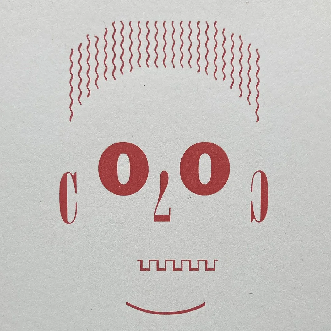
Art!Official Intelligence (A.I.) made by Linotype machine. This Linotype AI will hypnotize and mesmerize. No microchips or batteries needed. More on the Ink page.

"Night Palace" book release this Sunday at the Birkenfeld Theatre in Clatskanie! Info here.

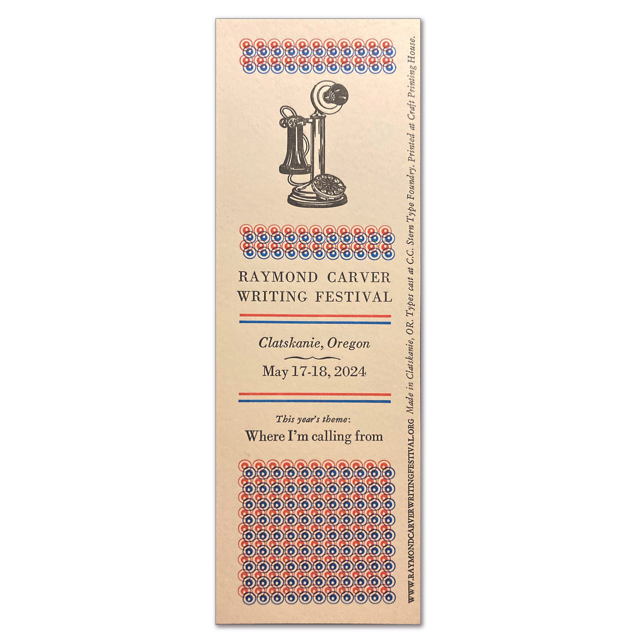
Freebie Bookmarks for the Raymond Carver Writing Festival. Edition of 600. Types cast at the C.C. Stern Type Foundry. I'm not sure what Dwiggins would think about the psychedelic-americana treatment to his Caravan 1287 Decorative border slide, but I like it. Raymond Carver Writing Festival is this weekend, May 17th and 18th. Clatskanie, Oregon. www.raymondcarverwritingfestival.org
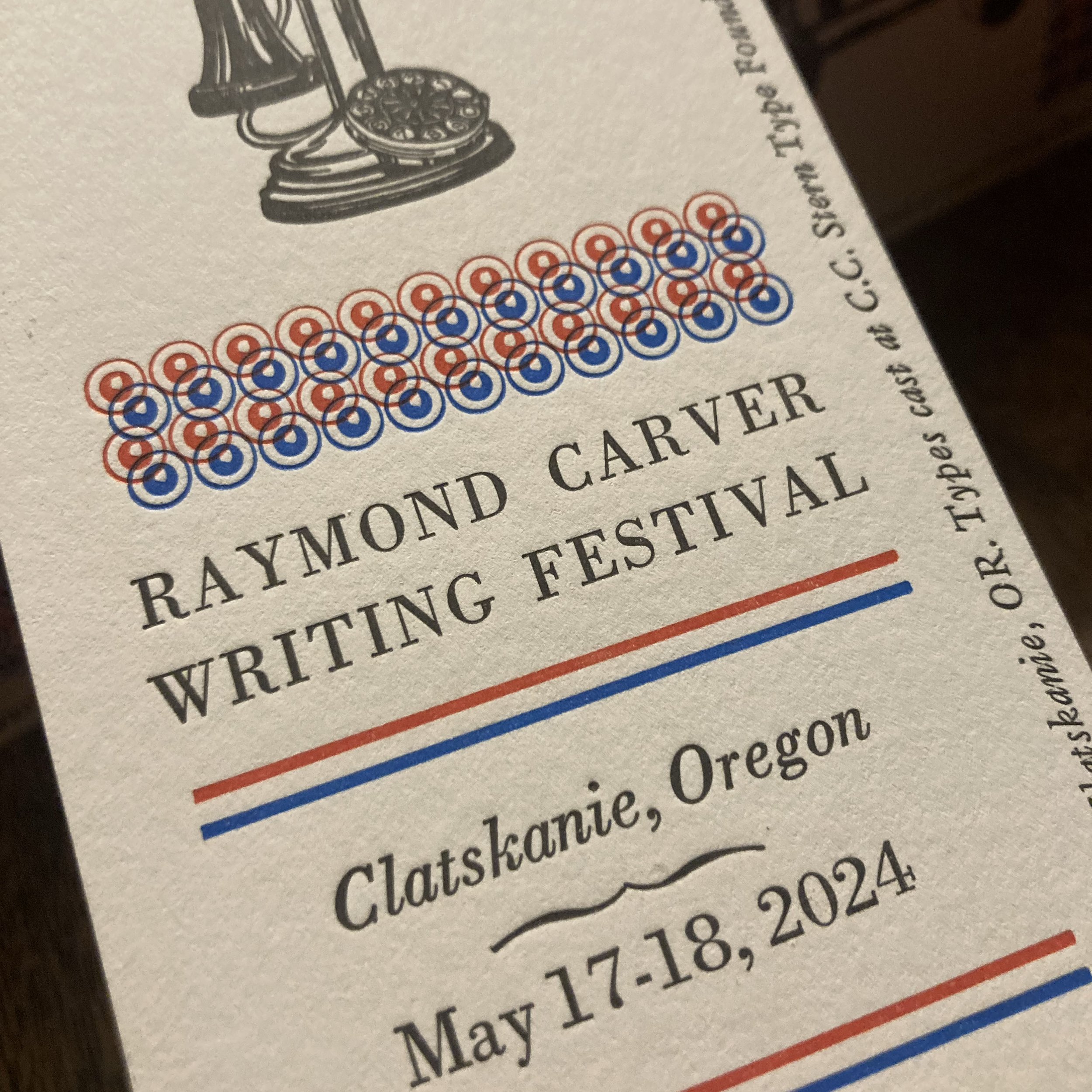


It's Raymond Carver Writing Festival time again. This weekend, May 17th and 18th. Clatskanie, Oregon. www.raymondcarverwritingfestival.org
12" x 18" Poster made from types cast at the C.C. Stern Type Foundry, and also some worn but loved wood and foundry type. The photo engraved magnesium halftone of Carver was recycled from last year’s poster. Also, we had fun with the "split fountain" background, though in reality the fountain wasn't used. "Split distributor roller." Doesn't quite roll off the tongue. Edition 300.

The 25th annual Portland Old Time Music Gathering is here. It has been 25 years, folks. It's amazing that what started as a small, scrappy, DIY grass-roots volunteer-run mini-festival, has grown to become a much bigger scrappy, DIY grass-roots volunteer-run-festival. I say this with all the love of course. There's a lot of heart and a lot of community around this event.
Stumptown Printers handled the graphic work during the early days of the gathering. Since this current year marks a big anniversary for POTMG, Bubbaville Board President Kate Sheie asked me to do the graphics again. It was a fun project to revisit. I thought that we should list as many musicians, bands, volunteers, sponsors, venues as possible that have helped to build this Portland Old Time Music community over the years. We managed to compile 781 names. (The small type that makes up the "flame" shapes is the list of names) 781 names! That's amazing. I know we've missed names, so big apologies if you or your band name is not on the list. We didn't establish a consistent way to archive year to year info, but after this exercise, we're a little closer to having a complete archive within the Bubbaville collection of info.

Graphic notes:
Print Method: Offset litho in 2 spot colors (Warm Red and K)
Finish Size: 14" x 20"
Paper: Royal Sundance 80# Felt Text Warm White
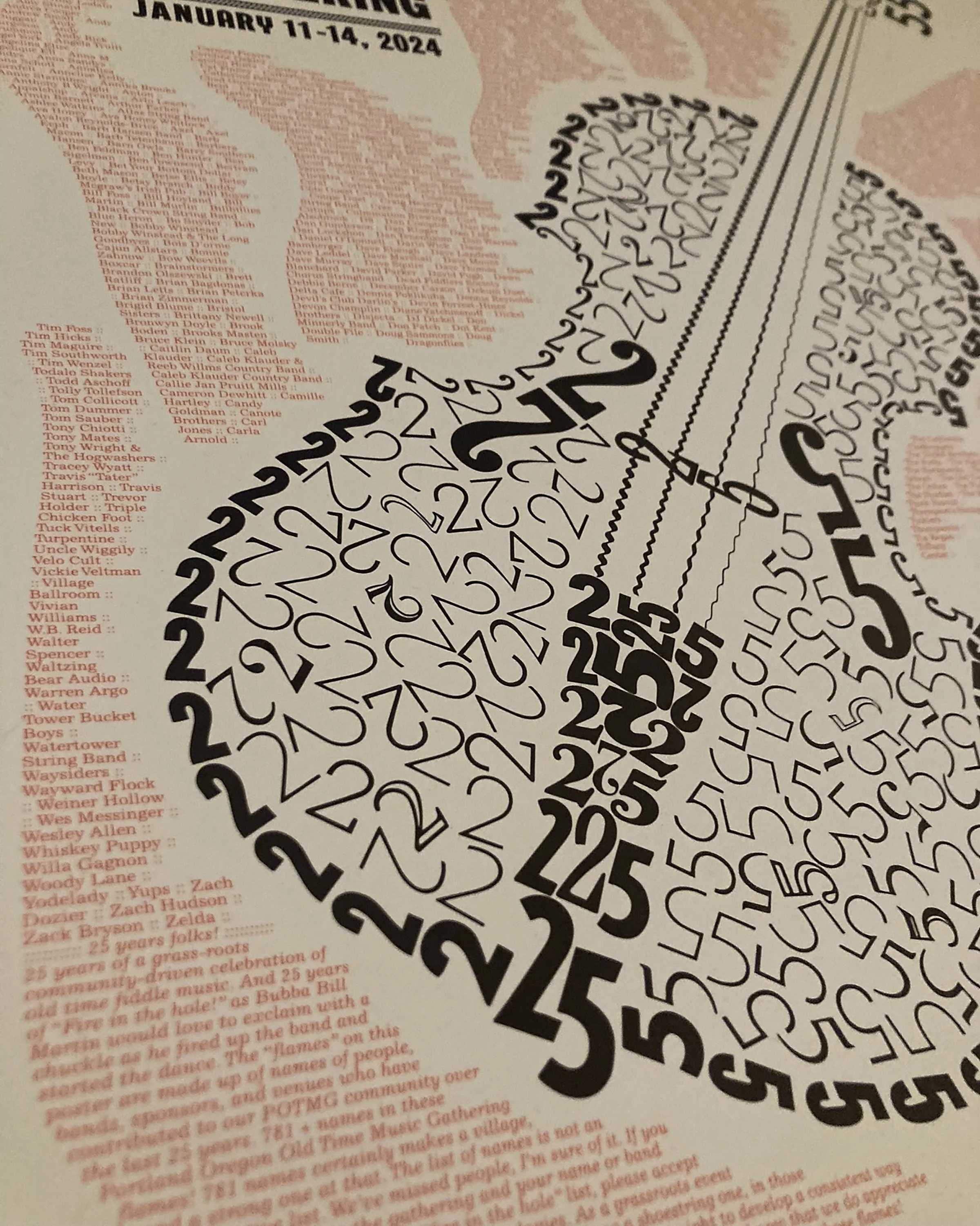
Source types are arranged from a combination of Repo Proofs from cast Linotype typography and decorative border (cast on Pioneer Press Model 31 Linotype Machine at the C.C. Stern Type Foundry) and Linotype digital type (6pt Excelsior and some Franklin Gothic). I made a rule for myself in creating the fiddle graphic - all the figures are proportionally true to their original form in relationship to surrounding figures - meaning I did not scale the individual figures. This includes the wave border matrix slide rule that forms the fiddle strings. I did increase the scale of the overall fiddle once it was complete and digitized. The repo proof components were all digitized and combined with the digital type faces. Film was generated from the digital file, metal litho plates were made and then printed offset on a M.A.N. Roland 200 by Richard Gwinner.
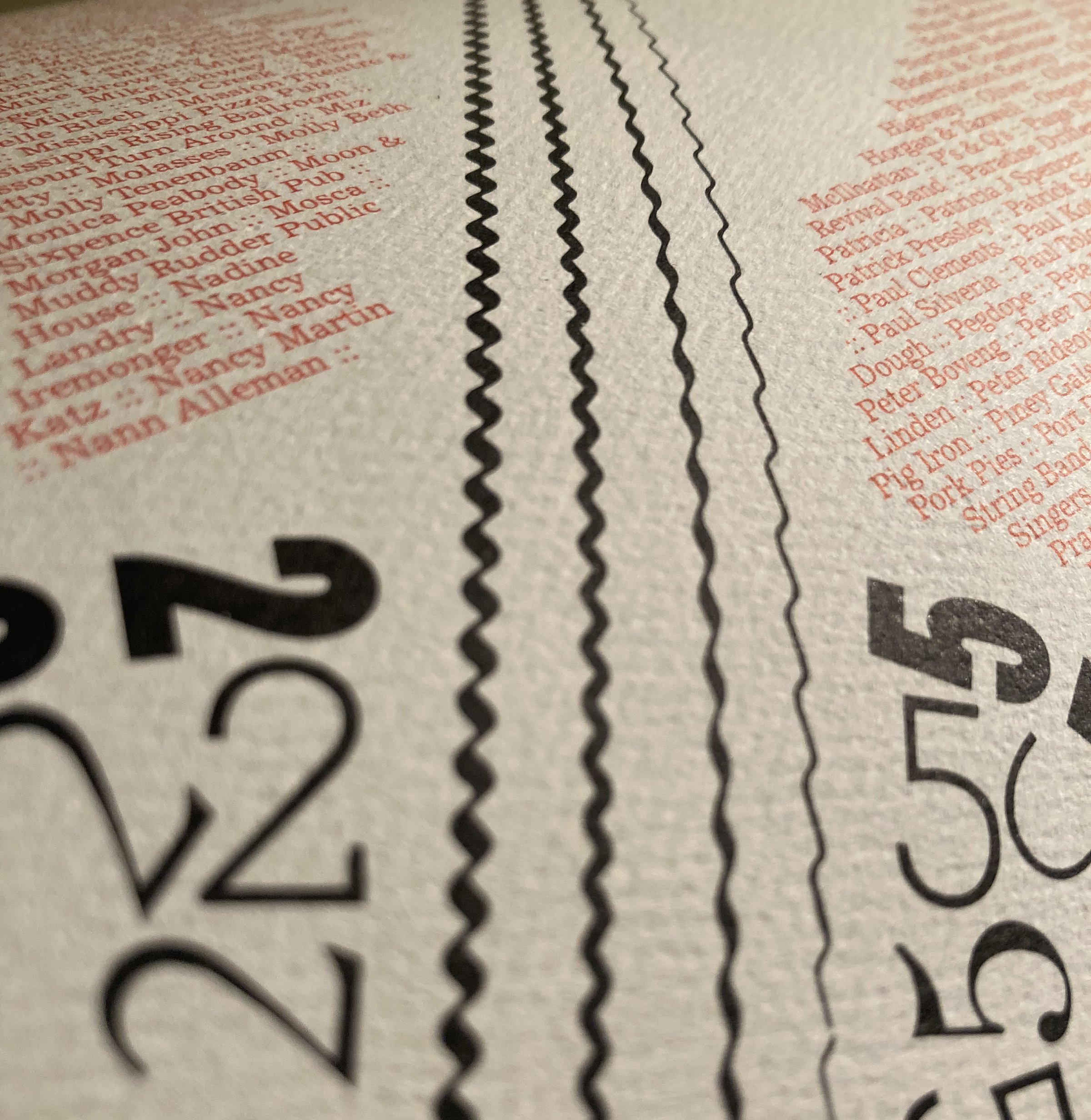
There will be a limited number of these posters for sale at the Gathering. Proceeds go to Bubbaville to be used for continued community music programming. So pick one up while you're at the Gathering!

No-Nonsense heavy-ink printing for the Raymond Carver Writing Festival. This poster incorporates some fresh type that happens to be some of the first type cast at the C.C. Stern Type Foundry's new location in Clatskanie.
A worker at a bookshop where one of these prints was posted commented that it looked like an old poster promoting a boxing match. Yes! I like it. Somehow this seems fitting for Carver's work.
The C.C. Stern Type Foundry is a co-sponsor of the Raymond Carver Writing Festival. Some of us foundry members will host “Parking Lot Poetry” in the Safeway parking lot alongside Highway 30 in Clatskanie at noon on Friday, May 19th. "Parking Lot Poetry" commemorates an impromptu poetry reading that Raymond Carver and his wife Tess Gallagher held at that same location back in 1984 during a visit back to his birthplace of Clatskanie.
The C.C. Stern Type Foundry crew will also be at the reception with a tiny press ready to help *you* print a writing festival keepsake created from type cast at the foundry. We hope to see you there.
Flatfoot in the Ashes print and fiddle tune. This is a quick video to provide some context for those of you who have received this small-run print composed with handset metal type and Linotype ornamentation.
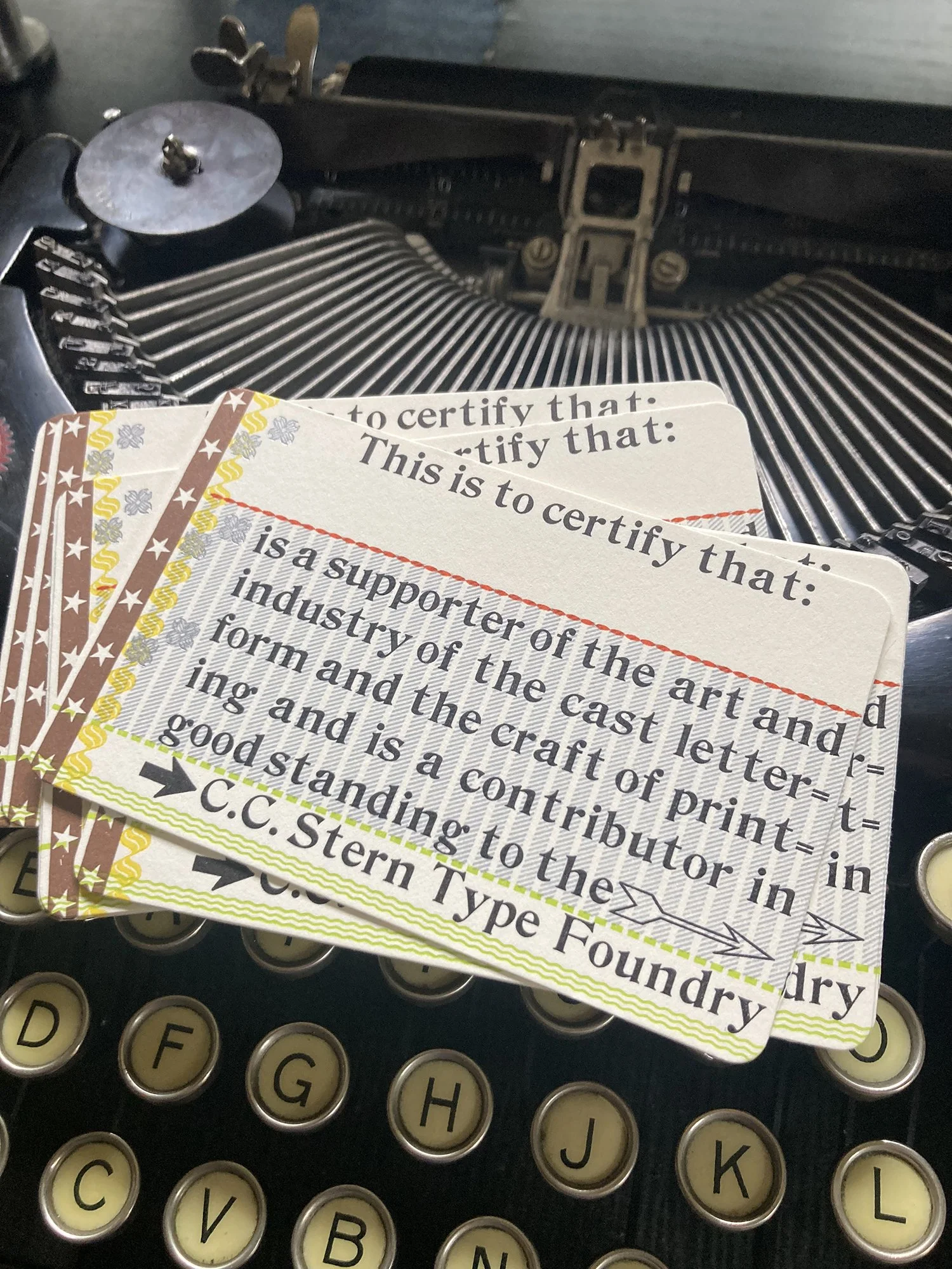

Printed entirely (almost) from type and ornamentation cast on the C.C. Stern Type Foundry equipment (The "almost" refers to the two arrows. Those are likely a product of American Type Founders, and were re-discovered hiding in plain sight on a galley labelled "arrows" appropriately enough).
Have you renewed your support to the C.C. Stern Type Foundry at the Printer's Devil level or above? If yes, you'll receive your very own limited edition guild card like the one pictured above.
Completing the new guild cards made a good excuse for me to bust out that beautiful Remington portable typewriter. I love that thing. I loaned my original Remington portable to a friend... oh, lets see.... I think it was almost 30 years ago. Yup. Now I recall that it was around 1994. A good year, that 1994. I'm getting side tracked on a side track. Back to the loan of the typewriter: my friend is a film maker, and he needed a good typewriter for the sound foley for his film project at the time. I don't recall the name of the film he was working on, or if the sound of my typewriter made it to the silver screen or not. Regardless, the typewriter is in good hands, so I didn't prioritize reclaiming the little machine before I pulled up stakes and left Dayton, Ohio. I foolishly forgot about the typewriter - until I didn't - many years later. At that point I kept my eyes out for the same model. I finally tracked one down about a year ago. This one was meticulously cared for by its owner who lived in Corvallis, Oregon. It was the same model and year as the one that I longed for over the last couple decades. It was pretty magical putting those familiar keys back under my fingers. I'll be happy to let you use the typewriter, but I may be a little more careful about lending it out for too long.
It's Monday, November 14th.
Soundtrack for the moment:
Charles Mingus Quintet - Haitian Fight Song
Defiant. Rolling. Thumping and blowing.
Mingus: "Making the simple complicated is commonplace; making the complicated simple, awesomely simple, that's creativity."
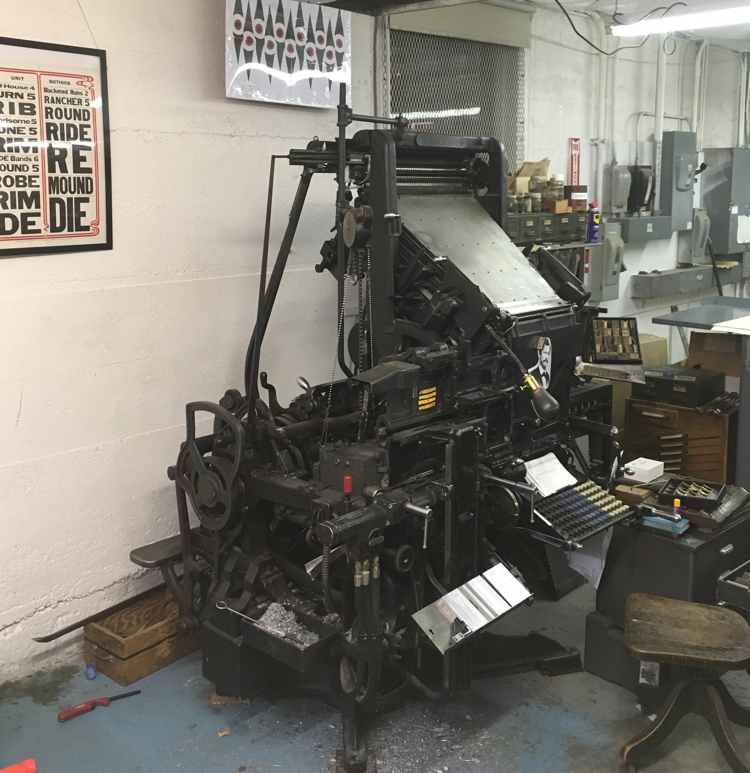
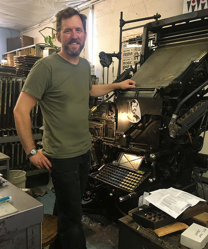
Pictured above is the "fiddleink" Linotype model 31 machine located at its former digs on North Interstate Avenue in Portland.

During a hike at Eagle Creek well over ten years ago, and well before Eagle Creek caught on fire (but that's another story), my good buddy Marko Whens and I discussed opportunities for collaborating on a print project. At that point, Marko had amassed a collection of his interactive poems, and I had just amassed another chunk of cast iron in the form of a Linotype machine. The machine needed work, and I needed work to move beyond my fledgling knowledge of Linotype machine operation. A deal was struck. After the work day was complete at Stumptown Printers, I would sift through matrices and molds, and use Marko's poems as material to test the machine and my knowledge. Slowly type was set, the machine was repaired and I gained some Linotype chops. But, job work took over and the type was stashed on galleys to gather dust for many years. In late 2018, and once we faced the reality that the increasing cost of rent for the shop was no longer tenable, I rediscovered those galleys and prioritized casting the remainder of the type before the machine would be placed in deep storage. Typecasting was complete, but the shop move took over, and once again the type sat - this time in boxes until our temporary garage shop was finished. The book was finally completed in late 2019. Marko had planned to hold an event in the Spring of 2020 to launch to book release. But, a pandemic happened. So, I'm excited to let you know, that after many years, that book release finally happened on April 2, 2022 at Passages Bookshop. The book is also now available for purchase here on this site. For more details on the book, go here.
The machines were humming at the C.C. Stern Type Foundry today. Connie, Joe, and Rebecca were working on the comp caster and had success in casting type for our upcoming issue of The Point. Jeff and I filled a Linotype galley with decorative border rule (also for The Point) and type to be used for bookplates. It has been a gorgeous day out here in the Pacific Northwest, made better with the gathering of the type casting crew and happy machines.

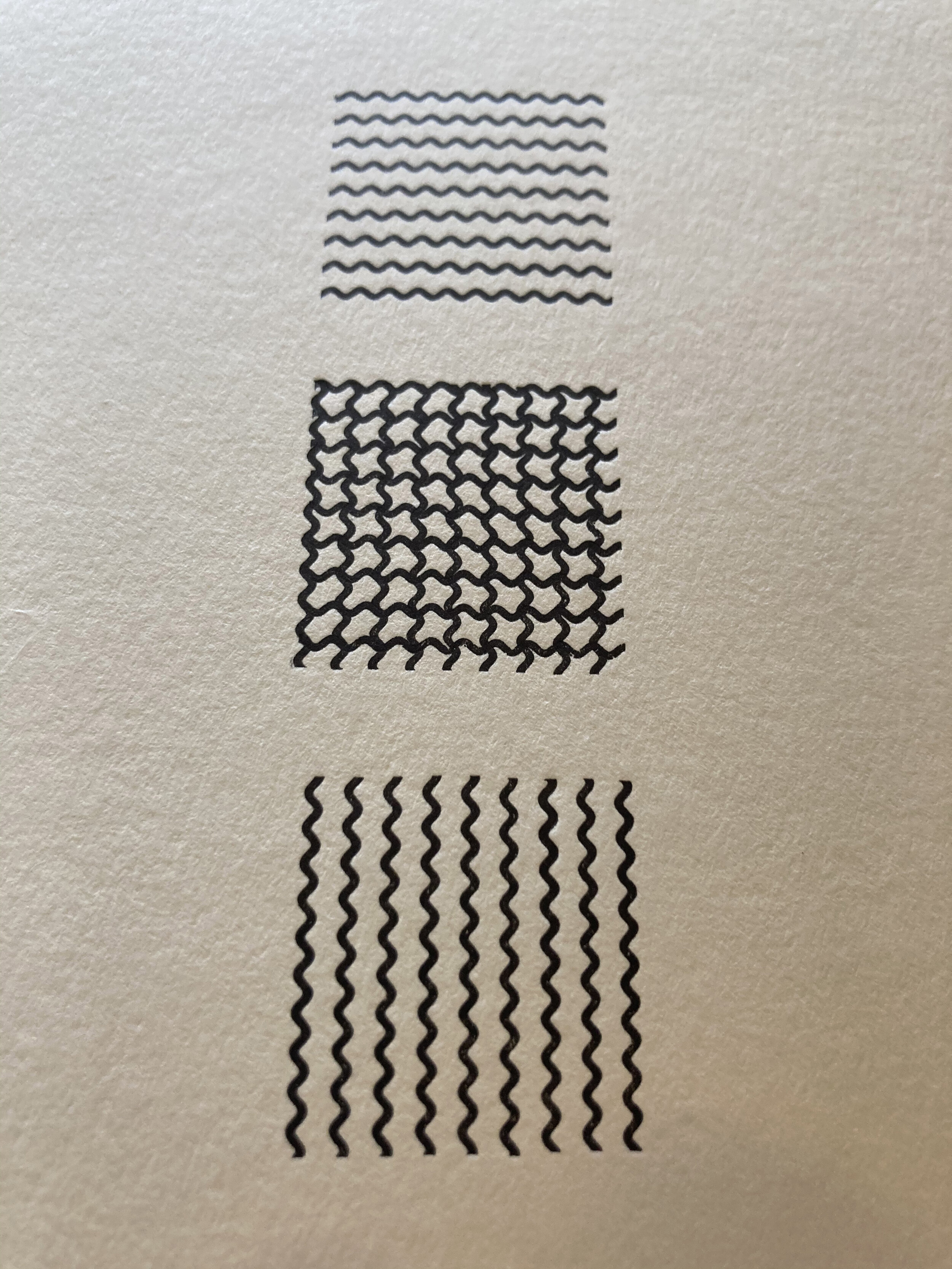
Mixing verticals and horizontals. Wave border 6pt 134B cast with 8pt mold. 9 pieces trimmed to 6 picas makes a perfect square and creates an opportunity for some overprinting shenanigans. I was surprised at the results of the overprint - I hadn't expected the pattern to look like this, but I'm not going to argue with the magic of print and Linotype wave border rule.
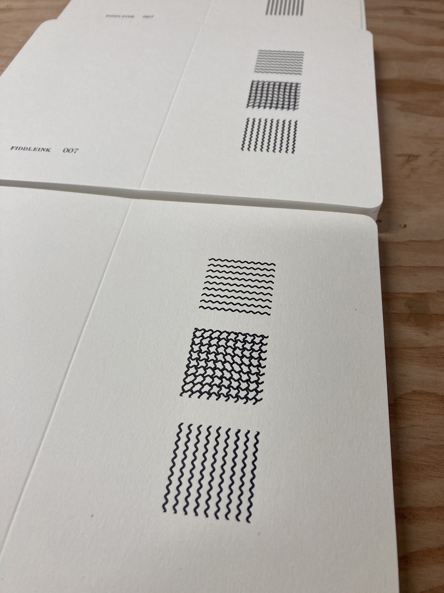
Fresh silver. Cast from two matrix slides, wave rule 6pt 134B and regular rule 407. This casting was the result of an afternoon of making adjustments to the Linotype Model 31 at the C.C. Stern Foundry this past weekend. The machine is now in adjustment, and these beauties are ready for ink.


Photo from Vamp & Tramp, Booksellers

Photo from Vamp & Tramp, Booksellers
Earlier this year I had the opportunity to see Barbara Tetenbaum's completed artist book "Old Friends in Nebraska; Mesostics on the introduction to My Antonia" which included Linotype composition which I had set and cast at Stumptown Printers shortly before we moved out of the Interstate Avenue shop space. Barb and I had proofed several faces before settling on 10 point 496 Caledonia.
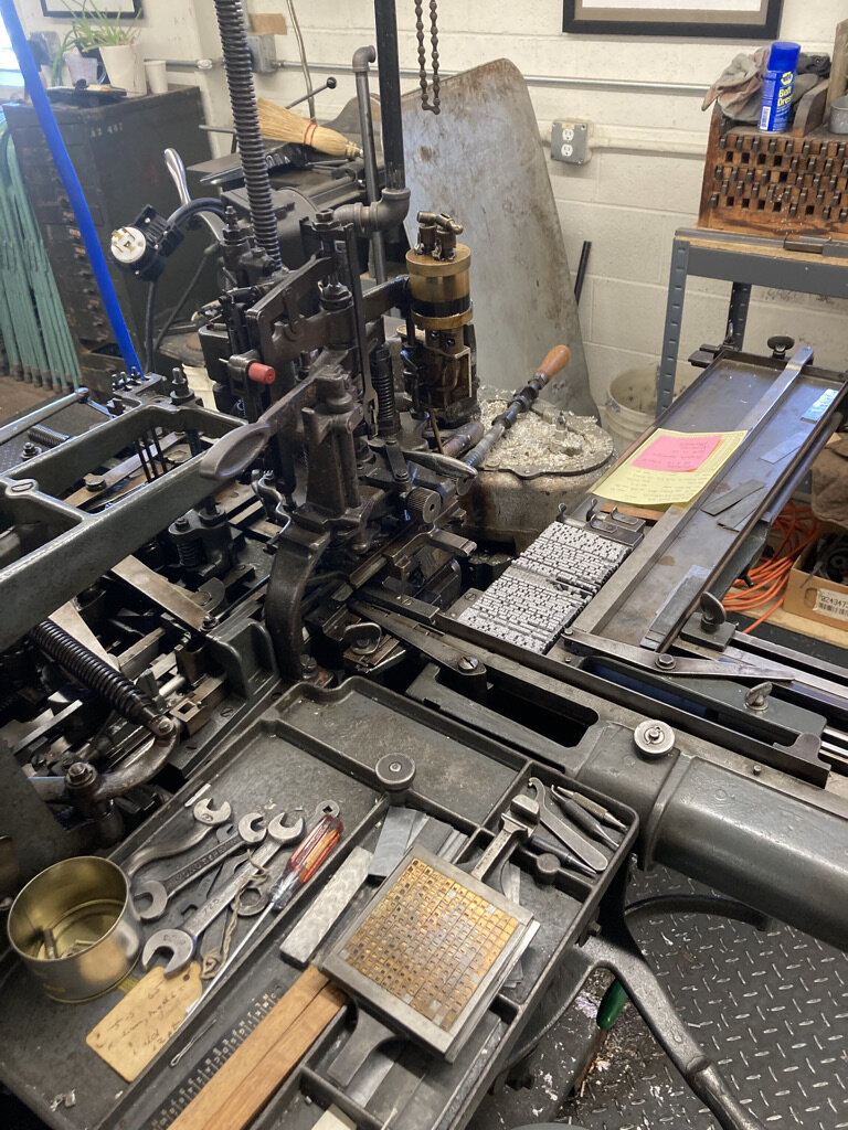
From the perspective of Linotype composition, the mesostic form requires an unconventional alignment — the text is arranged so that a vertical phrase intersects lines of horizontal text. I first attempted to hand-insert thin spaces while keeping a close eye on the assembler slide em scale to achieve the alignment. It didn't work. It was labor intensive and provided less than ideal results. I settled on a more time intensive though much more reliable method, which was to employ the machine's quadder and the Hammond glider saw. Each line was cast twice with left and then right alignment, and trimmed to form the single “mesostic” aligned line. This allowed for more controlled letter spacing, in which a half point at a time could be cut with the saw.
The finished piece is beautiful and meticulously printed. I’m happy that the Linotype composition made the cut! Below are photos of the casting and proofing process.



A continuation of an exercise to explore the meaning of acronyms found in online and text communication. Jeff provided me with a list of them. This list lives on top of the Linotype keyboard. I've had to search for the meaning of some of the listed acronyms multiple times. Instead of committing their meaning to memory, I prefer to make up my own meanings, and then forget those. Anyway, this exercise also serves as the framework to take a deep dive into one single type face: 14pt Intertype Bodoni Book 961. I enjoy the constraints. One typeface, a limit of 4 hours (the normal duration of open hours at the C.C. Stern Type Foundry) and an acronym that I don't understand. "IDK" will be the 4th print in this acronym-type-specimen exercise.


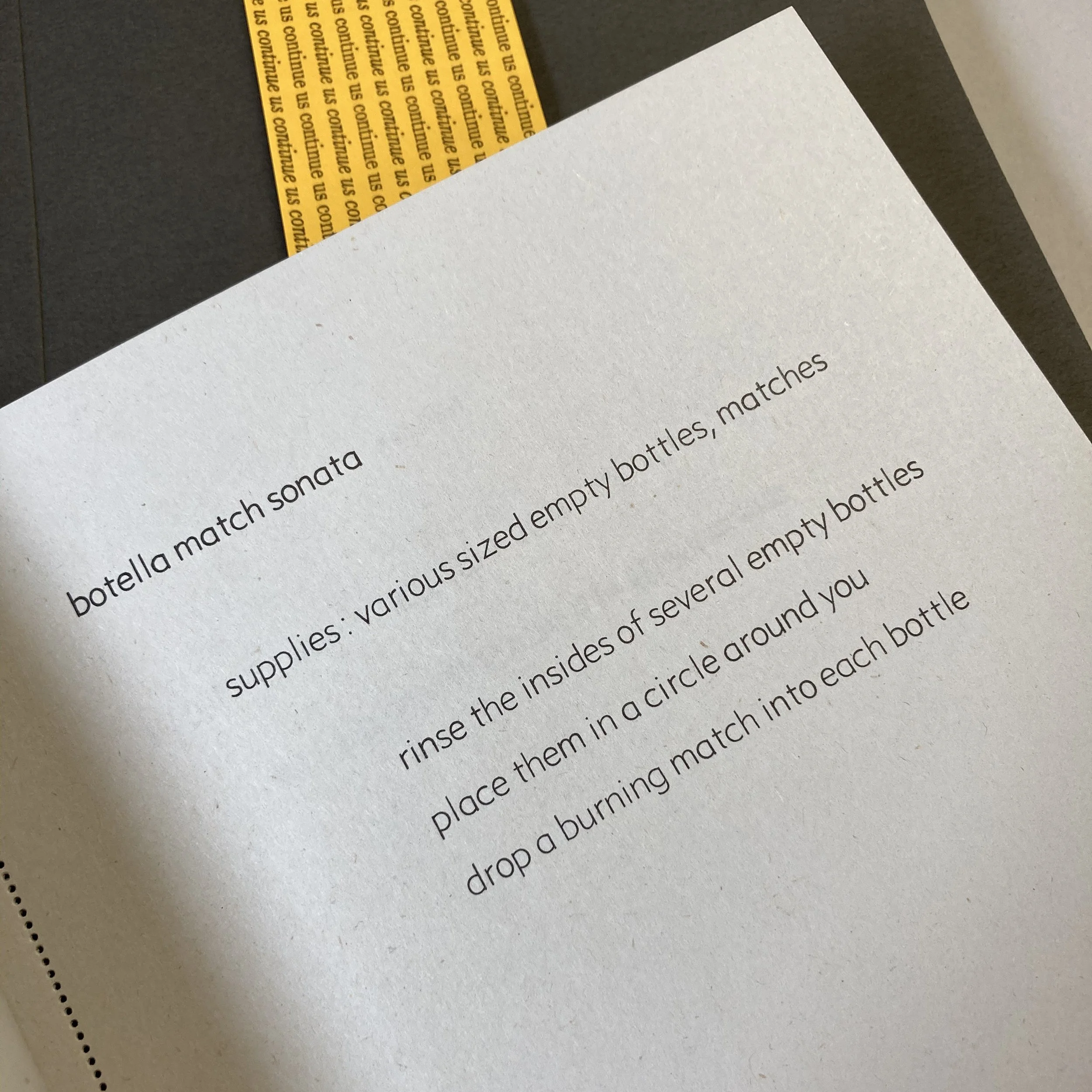
"Continue Us" Belly Band (or OBI strip) complete and in place. "Continue Us" by Marko Whens is an exercise book of poems. Edition of 72. Pages printed on newsprint. Composition Linotype.
