

Quote from Bohumil Hrabal's book "Too Loud a Solitude" cast and printed during C.C. Stern Type Foundry open hours. Type cast on the foundry's 1948 Linotype Model 31. The colophon pictured above provides additional details. I believe that a couple of these prints are still available, ask for one the next time that you visit C.C. Stern Type Foundry.

proofing Excelsior 11 ^ 120 at the C.C. Stern Type Foundry
Recent project at the C.C. Stern Type Foundry: Run mats out of the magazine, proof and inventory, clean mats, clean magazine. This proof is of Excelsior 11 ^ 120. We’re short on the lower case “r.” There are only 2. That will be a problem. Hopefully they’re hiding out in a sorts drawer somewhere. Also, after going through about a pig’s worth of metal while casting this, the slug consistently was rough on the right side. This problem persists even after having replaced the mouthpiece and sawing out the throat. The mouthpiece heater is probably on its last legs. For now, I’ll add em spaces to avoid the edge of the slug, but will certainly have to revisit this issue in the future.
A budding romance with Metromedium No 2., “Pressing On” film screening and an excuse to gather with Portland print pals

Metromedium No 2. (top portion of arrow)
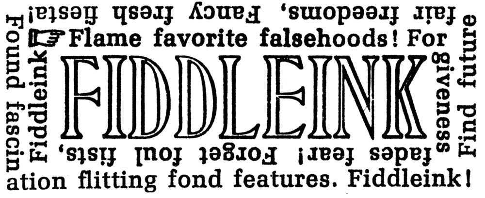
Metromedium No 2 (14^198, 14^186) - has been on my mind. I’ve been having fun casting and printing it. It is bold yet holds a distinct grace and plays well with ink. It prints nicely. And at 14pt, it’s an smooth runner on the machine. Initially I found the appearance of the figures “5” “0” to be a little striking (see pic) - I had suspected that sorts belonging to another version of the typeface had errantly found their way into the magazine. But no, the font number was confirmed and matched. I think it’s a nice feature - the lighter stroke of these figures add a “pulse” to surrounding text which teases the eye along the page. I’m also happy that this particular font includes the “special No 1” cap W, which was not the standard cap "W" redesigned for "Metro No. 2." As I understand, the "special No 1" sorts reflect Dwiggins’ original Metro drawings. (However, a third version of the cap "W" was also offered as an option as indicated in the Linotype's "Big Red" spec book, so don't quote me on that) More info about the evolution of Metro can be found in this excellent article by Paul Shaw. Anyway, the mats are in good shape, the sidewalls are sound and I’m tickled to cast and print from them. Here’s another example of the typeface used in recent piece set in all caps.

Note 2 alternative cap "W" characters


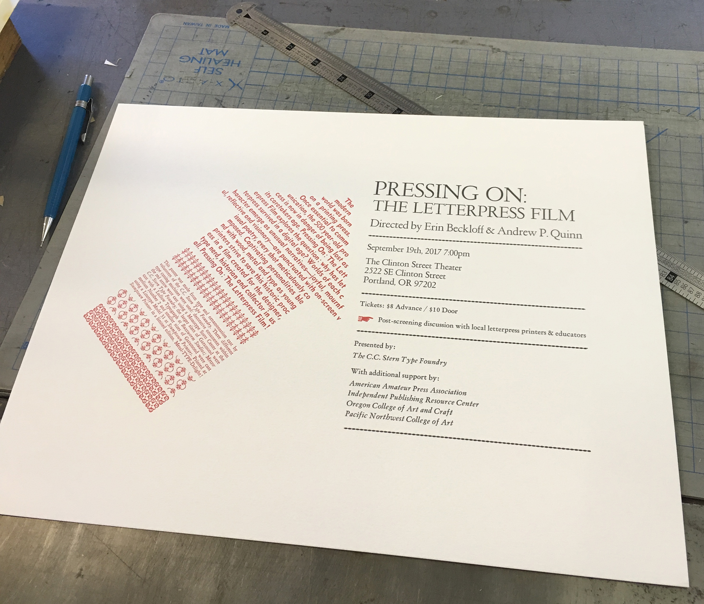
Final Poster.
The broadside / poster pictured was printed to promote an upcoming film screening and panel discussion sponsored by the C.C. Stern Type Foundry. Foundry volunteers cast the type used on the poster, Jeff Shay cast that gorgeous cutting of Garamond (48pt, 24pt, 18pt) on his Ludlow at Buzzworm Studios (after proofing these slugs, I went down a Robert Hunter Middleton internet rabbit hole - to be explored later. Hopefully Jeff will be my guide, because it looks like I could get lost real fast. Amazing stuff there…), Rebecca Gilbert cast decorative ornaments on the monotype sorts caster at the C.C. Stern Type Foundry, and I cast the above mentioned Metromedium No 2 and smaller sizes of Garamond using the Linotype at Stumptown Printers. Rebecca then masterfully handled the press work at Stumptown Printers. The poster was a good excuse for a collaborative hot-metal project. Nice work, team!
If you’re in Portland, please come to the event.
Pressing On: The Letterpress Film
Tuesday, September 19th
7:00pm
Clinton Street Theater
2522 SE Clinton Street
Portland, OR 97202
For Advance Tickets go to the Clinton Street Theater site
For info about the event, here's a post from the C.C. Stern Type Foundry Website