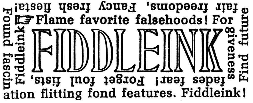

The official CD release show is a week from today at the Moon and Sixpence Pub, but I've got some available for purchase here and now. Cover designed and printed entirely from Linotype composition. The package design is "The Fremont Folder" by Stumptown Printers. See additional pictures, specifications and information about this print here. To learn more about the music, click here.

A silver (type metal) lining
Folks, it has been an interesting time in my world of commercial print. General overhead and cost of doing business is going way up, print runs have been going way down. The customer base at my workplace Stumptown Printers is still going strong, the commercial work that we do is always fun and challenging, but the name of the game in the industry are clicks on the press, and the clicks aren't what they used to be. Gone are the days of 15,000 "limited edition" custom paper-based CD packages. Low clicks and high costs aren't a good recipe for a "mom and pop" commercial job shop. We're hanging in there, riding it out as long as we can, and also adjusting our vision for a future of "analog" ink-on-paper classic printing.
Honestly, while I'm worried about our business and my livelihood, I have more concern for the music biz as a whole, and especially how decreased sales of physical music releases have impacted aspiring independent musicians. Man. Without sales of affordable music media*, it's tough for the small independent artist to make enough scratch to cover the expenses of tour, etc. Really, I don't know how "the kids" do it these days, and I hope that the tradition of hopping in a beat-up van with your bandmates to tour and share music, build community, have an adventure, and learn a thing or two about life is still viable. Gotta give those musicians love, folks. Please support them, 'cause it is getting tough to be a troubadour. And the troubadours make the world a better place.
Back to print. There is a silver lining to a lean commercial production schedule: I've had time to plant myself in the Linotype chair and work on creating composition for printing that is outside the scope of Stumptown Printers’ normal “job work.” It has been an absolute thrill to bond with the machine again. Really, I can't believe that a dirt-bag-commercial printer like myself has the opportunity to operate such a thing of beauty — a thing that in my mind stands as a monument to the machine era, the poetic balance of human hand, human touch, human ingenuity and power of cast iron, steel and brass driven by motors and flywheels. The Linotype machine is art and industry and everything in-between, and... it still works. It is still telling its story. Imagine that. My machine is from 1946. It has been through a lot. A lot of operators. A lot of news. A lot of celebration. A lot of death. A lot of all of it. And while it needs attention and repairs, it still dutifully creates beautiful type. Some of which has never been digitized, has never seen a computer. And all of which looks a heckuva lot more beautiful and much more of this world than its digital counterpart. It is a gorgeous thing.
I can count myself among a relatively small handful of folks who have the honor to be the custodians of these wonderful hot metal type composition machines, and as such, it is my goal to keep this one in good working order and casting nice type beyond my time at its keyboard. Just as the operators before me have done. That's the idea. And that goal can't be accomplished if the machine is idle. It is happiest when it is doing what it was designed to do: cast type.
So let’s do it! Time to cast.
Below is a list of projects that I’ll be working on while I have the extra time to sit behind the Linotype keyboard. I'm sharing these projects with you to put a little extra pressure on myself to see these projects through to the inking stage. Thank you for being an unsuspecting accomplice.
- The Horsenecks "Fiddlehead" CD cover. Printed exclusively from Linotype Composition. Additional info here.
- Lino-Lager beer labels, coasters, and ephemera. Yes! A beer to honor the Linotype and its inventor: Ottmar Mergenthaler (I’ll be handling the printing and Linotype, not the beer-making)
- Composition for a series of mesostic poems for artist, mentor and good friend Barbara Tetenbaum.
- Mother Foucault's Bookshop monthly calendar of events (See post here)
- 12"x12" broadside subscription series
- An artist book for my buddy Mark Owens. I cast this type years ago, but haven’t finished it. Time to dust it off and put some ink to the forms.
- Linotype Matrix Slide Being. 3rd in a series of 6. (Previous prints can be viewed here and here)
- Composition for “The Point” a small publication put together by the C.C. Stern Type Foundry Crew.
- Linotype Matrix slide inventory and notecards. Over the years I’ve acquired a fair amount of border Matrix slides. Many of them have not been identified or inventoried, so I hope to print a limited selection of note cards using the border matrix slides as I’m identifying and organizing them.
If you are in the neighborhood of Stumptown Printers, stop on by to see the progress of the projects listed above. You'll find me behind the Linotype keyboard.
* Yes, vinyl. I know. Sales are up on vinyl. I love it. There's nothing like building a relationship and appreciation for a band or artist when listening to a record. It's the way to do it. Also, as a printer, the larger format of a 12" record offers opportunity to lay down some fancy ink and artwork. That's all good. But it takes some serious coin to release a vinyl record, and it's a serious pain to haul records around on tour.

Mat Inventory, long overdue....
I squirreled away these 3 galleys of Caledonia after discovering them among a collection of matrices I recently purchased. I had no idea whether the fonts were complete or not, but was looking forward to running some tests. Recently I had the opportunity. I'm working on spec'ing type for a book project, and I'm hoping that this type will fit the bill. Rebecca took inventory of the mats - aside from a couple missing small caps, they appear to be complete. Next step: find a magazine to empty and clean....

Mother Foucault's July Events Calendar.
Mother Foucault's July Events Calendar. Edition of 300. Printed on newsprint.
Using some of newsprint's best pals, Linotype 8^502 Excelsior with Memphis Bold and 14^288 Memphis Extra Bold Condensed with Gothic No. 13. I love the functional beauty of those Linotype legibility faces - in this case complete with rowdy jumping lowercase "o" and dropping lowercase "t." This is the first time I had the opportunity to run these mats, I was pleased to find that they are in relatively good shape, and that they ran clean in the magazine. Mother Foucault's is hosting a lot of events these days, stop by and check one out and pick up a Linotype composed and letterpress printed events schedule.

Too Loud a Solitude


Quote from Bohumil Hrabal's book "Too Loud a Solitude" cast and printed during C.C. Stern Type Foundry open hours. Type cast on the foundry's 1948 Linotype Model 31. The colophon pictured above provides additional details. I believe that a couple of these prints are still available, ask for one the next time that you visit C.C. Stern Type Foundry.

Print production of unofficial Marfa Myths 2018 limited edition keepsake
Video clip of the print production of unofficial Marfa Myths 2018 limited edition keepsake. See additional pictures, specifications and information about this print here.
Type Jam with Mark Sarigianis of Prototype Press and a neighborhood scrap yard fire (unrelated events)


March 12th, 2018.
It's 11:07 on Monday night, and I'm writing this under a cloud of black smoke coming from a smoldering automobile scrap yard fire. There's an evacuation in place for our neighborhood two blocks up wind, but the EPA deems that the level of toxins over our place is at an acceptable level for humans. Okay. A moment like this does offer an opportunity to learn a thing or two about tires and tire fires - like this: One auto tire contains about 2 gallons of petroleum products. 2 gallons! When that tire is on fire, the smoke can carry fine particulate matter and other nastiness which may include asbestos, aldehydes, nitrogen oxides, polycyclic aromatic hydrocarbons, benzene, toluene, styrene, metals and dioxins. Interesting stuff. The kind of thing that one does not think about unless it appears in their backyard, or in the air directly above them.
Well, whether or not we're breathing that stuff in right now, that cloud has colored my thoughts a bit - I had intended to write about inspiring printing, not burning tires. We have enough garbage in our lives, I don't need to fill your eyeballs with more of it.
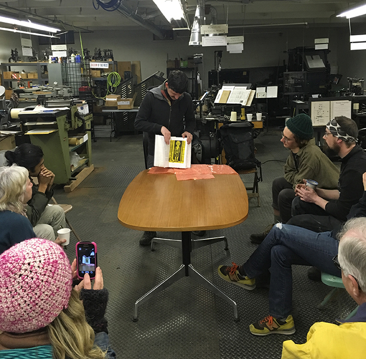
Which brings me to the topic that I had intended to write about in the first place: A recent “Type Jam” at the C.C. Stern Type Foundry featuring Mark Sarigianis of Prototype Press. There we saw a jaw-dropping example of the beautiful things people make - which is a heart warming antidote to the apocalyptic-trash-cloud that we're currently experiencing. The attendees of this Type Jam had the opportunity to take a first look at Mark’s recently completed fine press edition of Charles Bukowski’s “Ham on Rye.” In an edition of 52 copies, this 364 page, 5 pound (my guess) humdinger of a book is the result of two years of labor, love and even a healthy dose of suspense.
Set in 12pt Goudy Powell and cast by Mark on the Prototype Press Monotype comp caster, the typeface has a wobbly but stout appearance - fitting for the words of the professional drinker that Bukowski was. Nothing delicate about those letterforms, but there's poetry within that typeface all the same, and it holds the ink beautifully on handmade cotton paper from St. Armand. The book is illustrated with wood cuts by Sean StarWars. The illustrations are over printed on tint blocks which alternate with Cyan, Magenta and Yellow. The utilitarian color-tool-box of the commercial printer. Another nod to Bukowski's working class story.
Rebecca and I visited Mark about a year ago, shortly after the building where his shop is housed was sold. The new building owners required that his shop space be partially deconstructed. This was in the middle of the first half of printing Ham on Rye. We found him working away under blue tarps and five gallon buckets which were catching in-coming rain water. Mark was in the process of recycling forms that had been printed in order to make room and more type for the remaining pages of the book. Yikes. This is a stage of the book production where if a mistake is made; days, weeks, months are lost. A keen focus on triple-checking galley proofs and printed final sheets is critical. Yet Mark was undeterred. Under adverse shop conditions with no guarantee that the new building owners would continue to rent to the current tenants, the progress of the book hardly slowed. Pretty nerve wracking, I'd say. It is challenging enough to maintain old type casting and printing equipment so that it is capable of producing this level of fine press book work, so I find it very inspiring that Mark was able to forge ahead under the tarps and uncertainty of the immediate future of the shop location. Mark's edition of Ham and Rye is truly a beautiful monument to the poetry of the every day struggle that Bukowski is celebrated for.
Take that, tire fire.
Check out pictures and a much more thorough description of the book here at the The Whole Book Experience blog.

March winds are blowing in some fresh print related events at the C.C. Stern Type Foundry. You can read about up-coming events in the foundry newsletter here. This evening, there will be a "Type Jam" with Mark Sarigianis of Prototype Press. He’ll be discussing the production of his recently completed book: Charles Bukowski’s Ham on Rye. Two years in the making, this 364 page sandwich will surely satiate the hunger pangs of print inspiration and nourish the dreams of daily commercial print workers for months. Not that I know anything about that. Really, hearing Mark’s process and seeing his work is going to be inspirational, folks. Hopefully I’ll see you there.

Mail Call
Mail call. Love it. I received this treasure recently from my new Linotype buddy Rubén Brizuela of Editorial Martín Fierro in Mendoza, Argentina. It's a key chain from "Allegretta," a former parts supplier for Linotype, Intertype, Ludlow and Elrod machines. It was given to Rubén's father for being a loyal customer. Rubén is now responsible for keeping the machines running at his Father's shop. You can see his work here.

Recasting
Recasting a line from a Joe Green poem that will hopefully find its way on press soon. I originally cast this on a free weekend about a year ago, but job work took over and the poem was tucked away on a quiet galley. Now that the weather has cooled and nights have become chilly, the poem “House Warming” has been on my mind. Time to ink up! Today I found that the word spacing was a little tight on one of the lines – about a year ago I was excited to learn a trick which allows single position Linotype display mats to run on a duplex display mold. Must have been more focused on the trick than on the word spacing. So, fixed!

proofing Excelsior 11 ^ 120 at the C.C. Stern Type Foundry
Recent project at the C.C. Stern Type Foundry: Run mats out of the magazine, proof and inventory, clean mats, clean magazine. This proof is of Excelsior 11 ^ 120. We’re short on the lower case “r.” There are only 2. That will be a problem. Hopefully they’re hiding out in a sorts drawer somewhere. Also, after going through about a pig’s worth of metal while casting this, the slug consistently was rough on the right side. This problem persists even after having replaced the mouthpiece and sawing out the throat. The mouthpiece heater is probably on its last legs. For now, I’ll add em spaces to avoid the edge of the slug, but will certainly have to revisit this issue in the future.
A budding romance with Metromedium No 2., “Pressing On” film screening and an excuse to gather with Portland print pals

Metromedium No 2. (top portion of arrow)
Metromedium No 2 (14^198, 14^186) - has been on my mind. I’ve been having fun casting and printing it. It is bold yet holds a distinct grace and plays well with ink. It prints nicely. And at 14pt, it’s an smooth runner on the machine. Initially I found the appearance of the figures “5” “0” to be a little striking (see pic) - I had suspected that sorts belonging to another version of the typeface had errantly found their way into the magazine. But no, the font number was confirmed and matched. I think it’s a nice feature - the lighter stroke of these figures add a “pulse” to surrounding text which teases the eye along the page. I’m also happy that this particular font includes the “special No 1” cap W, which was not the standard cap "W" redesigned for "Metro No. 2." As I understand, the "special No 1" sorts reflect Dwiggins’ original Metro drawings. (However, a third version of the cap "W" was also offered as an option as indicated in the Linotype's "Big Red" spec book, so don't quote me on that) More info about the evolution of Metro can be found in this excellent article by Paul Shaw. Anyway, the mats are in good shape, the sidewalls are sound and I’m tickled to cast and print from them. Here’s another example of the typeface used in recent piece set in all caps.

Note 2 alternative cap "W" characters


Final Poster.
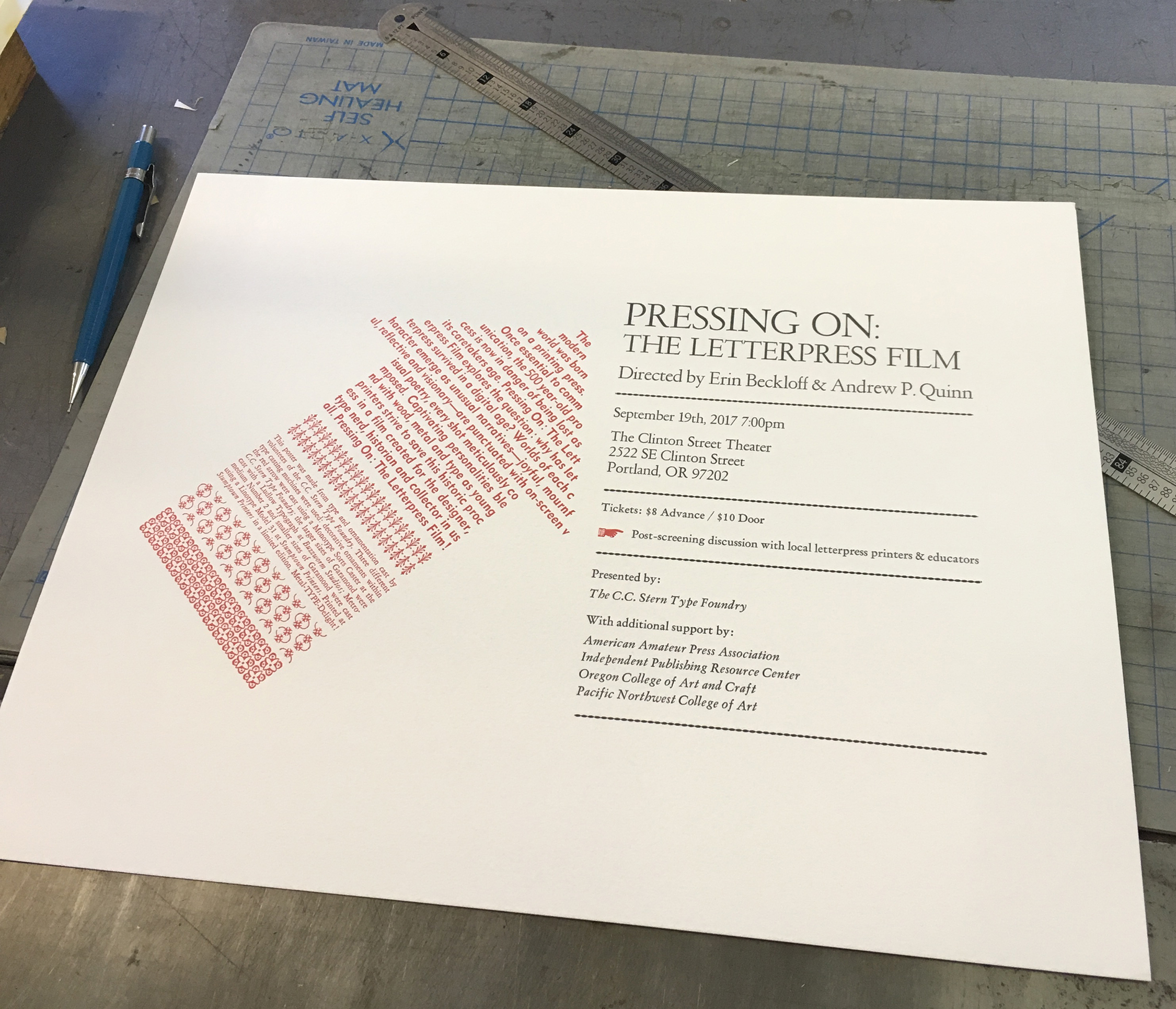
The broadside / poster pictured was printed to promote an upcoming film screening and panel discussion sponsored by the C.C. Stern Type Foundry. Foundry volunteers cast the type used on the poster, Jeff Shay cast that gorgeous cutting of Garamond (48pt, 24pt, 18pt) on his Ludlow at Buzzworm Studios (after proofing these slugs, I went down a Robert Hunter Middleton internet rabbit hole - to be explored later. Hopefully Jeff will be my guide, because it looks like I could get lost real fast. Amazing stuff there…), Rebecca Gilbert cast decorative ornaments on the monotype sorts caster at the C.C. Stern Type Foundry, and I cast the above mentioned Metromedium No 2 and smaller sizes of Garamond using the Linotype at Stumptown Printers. Rebecca then masterfully handled the press work at Stumptown Printers. The poster was a good excuse for a collaborative hot-metal project. Nice work, team!
If you’re in Portland, please come to the event.
Pressing On: The Letterpress Film
Tuesday, September 19th
7:00pm
Clinton Street Theater
2522 SE Clinton Street
Portland, OR 97202
For Advance Tickets go to the Clinton Street Theater site
For info about the event, here's a post from the C.C. Stern Type Foundry Website

Alumilite Pi
Linotype Alumilite Magazines Shall not be trusted. This is the second one that has failed on me. No fun. The brass bottom magazines are quite heavy to haul around, but those suckers are solid. I haven't experienced this issue with the heavier magazines.

Thank you for the Linotype love!
It’s an honor to have 3 fiddleink prints included in “Type Tells Tales” a recent book by Steven Heller and Gail Anderson. Drawing from early twentieth century to the present, this book documents selected work which explores non-conventional ways in which typography can convey a story. From the book’s intro: “A common theme is that type and letters are not passive, but are active participants in an entire composition” and “…our book is about well-meaning heretics who challenged and continue to bust standards.” Indeed. From the futurist letterpress print work of Fortunato Depero and Filippo Tommaso Marinetti, to the “analog” experimental offset lithography work of Walasse Ting and Robert Massin, to modern practitioners who meld digital techniques with traditional tools, there’s a lot in this book to be inspired by. I’m happy that my Linotype machine composed prints found a place among the pages. Thanks again to Abigail Steinem (Head Researcher), Steven Heller & Gail Anderson for the opportunity.


secret slugs
Today I cast a couple secret slugs to hide among the Linotype type order that I occasionally fulfill for a trade shop here in town. I’m not sure how they’ll take it: The Linotype operator owes the customer a beer? The customer owes the linotype operator a beer? The linotype operator is buzzed on beer? Hooray for beer? Who knows. I only hope that the press operator checks the slugs before printing. Secret Slug cast in Linotype 10^696 first and second position.

131 years...
July 3rd! It’s Linotype Machine anniversary day! Today marks 131 years of a distinct kind of music. The sound of solid slug of type sliding onto a steel galley followed by the sound of brass matrices rhythmically chiming as they fall back into place within the Linotype magazine. The persistent “whirl” of the distributor screw and the assembler chute belt, sounding a call for action. It’s a fabulous symphony, even when the machine sounds come to an abrupt halt, and gruff curses from the operator can be heard. It’s all a part of the wonder. Thanks to Steve Cole and the Baltimore Museum of Industry crew for rallying and spreading the word about the anniversary today. And cheers to all who are acting as the custodians of these amazing machines - keeping them happy and running for future generations to experience. Keep the cams rolling and the metal flowing!
Pictured above is yours truly holding Linotype 36 ^ 135 (Gothic Number 41) mats in front of the 1946 Linotype model 31 at Stumptown Printers.
Friday.
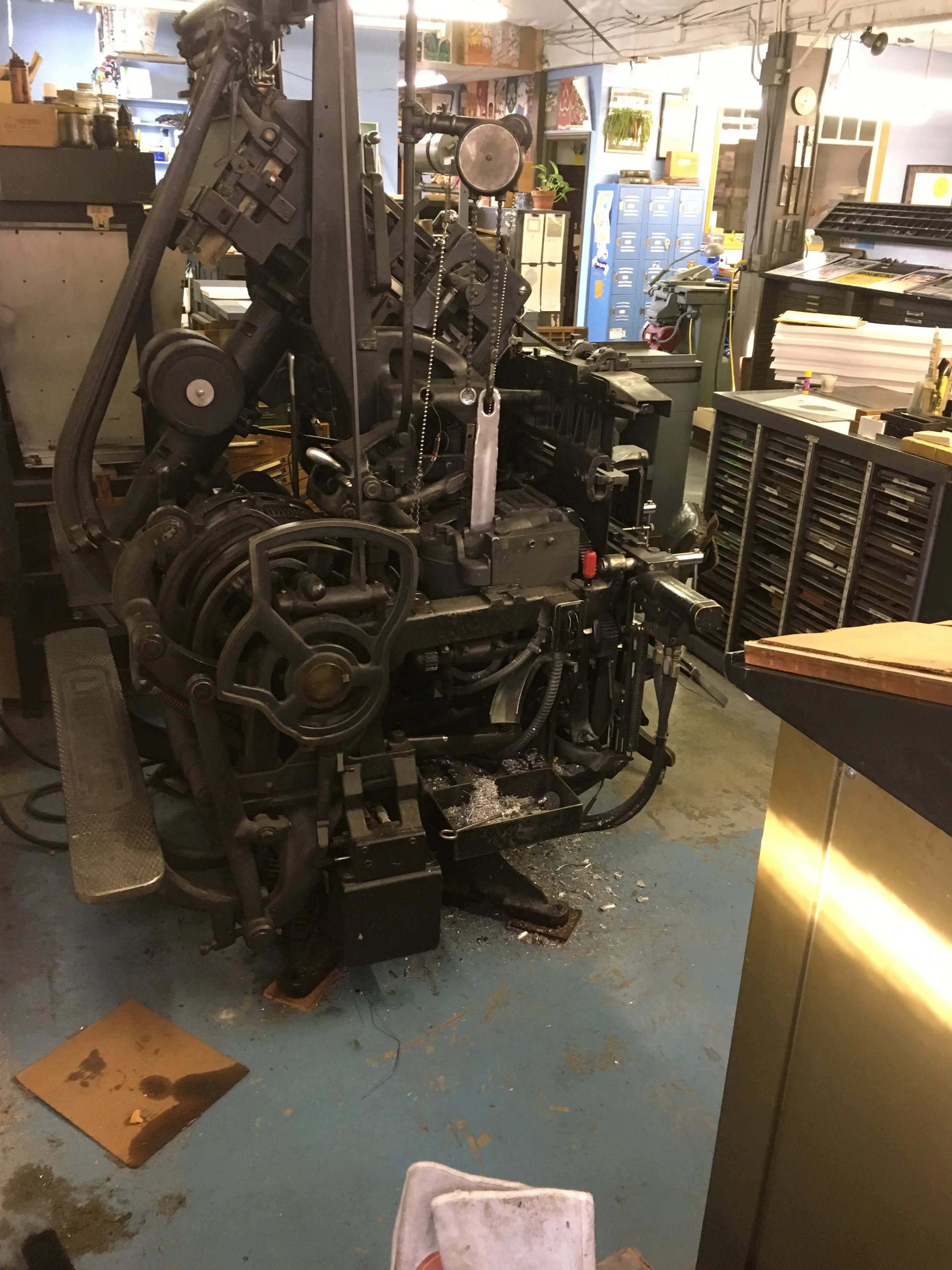
We're slowly making some room for the new magazines and racks. I'm standing in the space where a single bank type cabinet once stood. It's about the same foot print as one magazine rack. Need to make room for 5 more. Nice to see the machine from this perspective before the space gets filled up again!

Just hired this new guy.
All Night Long • Foghorn Stringband (circa 2006) • Live at the Cobblestone Pub • Dublin, Ireland
Video of Foghorn Stringband from May 6th 2006. Thanks to Bill Whelan (Rough Deal String Band, OXO boys) for documenting this gig.
In the key of "C" which means some fun bass runs and walks and stumbles. I also recall playing this tune with the Dickel Brothers. And with Crackerbox, a too-short-lived string band with P.T. Grover playing some of the crunchiest syncopated old time guitar I've ever heard, and Jason Noice playing high energy precision fiddle that also had plenty of sink-your-teeth-into-the-crunch under the hood. It's a fun tune, I'm glad that it's captured here with the Foghorn Crew.
The players:
Stephen "Sammy" Lind: Fiddle
Caleb Klauder: Mandolin
The Reverend P.T. Grover, Jr.: Banjo
Kevin Sandri: Guitar
Brian Scott Bagdonas: String Bass
